The large courtyard at The Museum of Modern Art in New York was arguably the world’s first urban sculpture garden. It was conceived and opened as part of the original gallery in 1939 and celebrated its eightieth year in 2019. MoMA Trustees Jo Carole Lauder and Bea Medinger felt that it was not properly represented by a cd-sized $10 book. They wanted a publication befitting a New York landmark.
The sculpture garden has been described as ‘the beating heart’ of MoMA. The galleries encircle the space and it offers even non-fee-paying visitors a moment of calm in bustling Manhattan. As well as featuring a changing collection of world class modern and contemporary sculpture, the garden has hosted a wide range of diverse events including car and fashion shows, concerts, film shoots, performances and protests.
The space became the Abby Aldrich Rockefeller Sculpture Garden in 1953 when Philip Johnson’s modernist design replaced the original by founding Director Alfred Barr. The garden was again reorganised and extended with Yoshio Taniguchi’s major overhaul of the galleries in 2004, though much of Johnson’s scheme was retained – including Harry Bertoia’s ‘Bertoia Side Chair’, and the large marble slabs.
The marble slabs – a constant since 1953 – contributed the format of the book, which is one third the width, and half the height, of a slab. The intention being that even the format of the book is permeated with the garden.
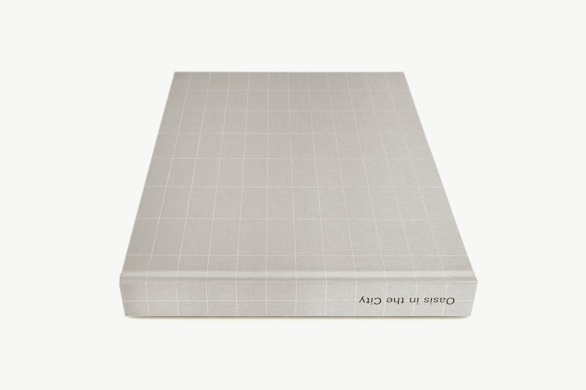
Weighing 3.4kg and with an open span of 83 cm, it is intentionally a physically significant book – it cannot be comfortably read on a crossed leg. The physicality of the book both heralds its import and demands space and attention.
During the briefing much was made of the ‘Miesian’ environment – that is to say an aesthetic pertaining to the modernist architect Mies van der Rohe who was a considerable influence on Philip Johnson. Considering Miesian elements in this context we thought of long, low, minimal spaces, and of highly refined materials and details. This was the starting point of the design.
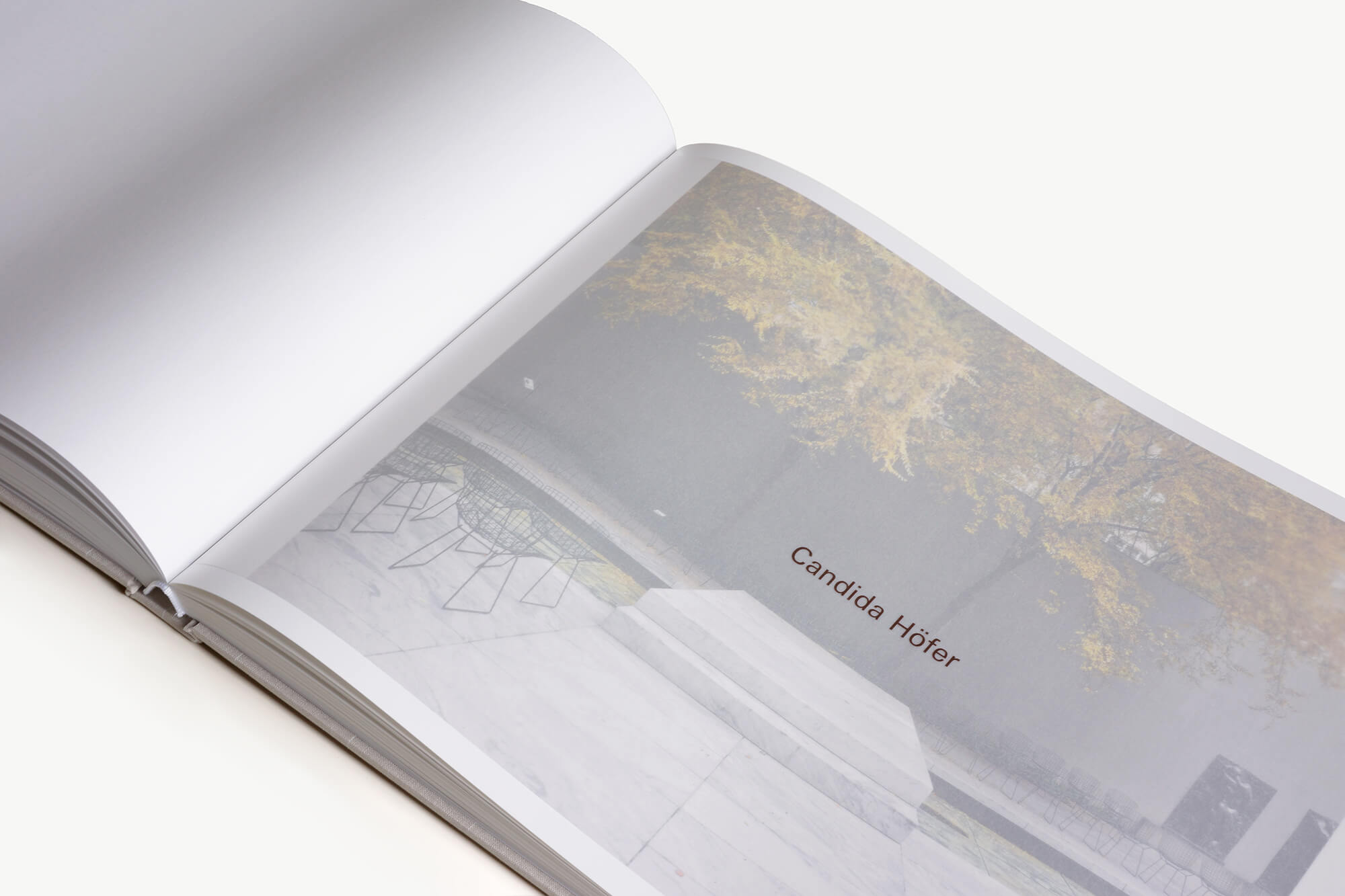
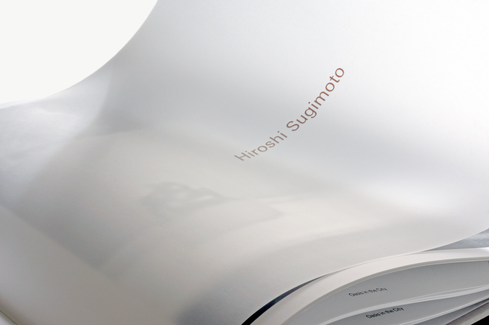
The book itself comprises of three main sections: An introductory essay charting the chronology of the garden; The main body of the book featuring images from the extraordinary photographic archive; and the final section which features newly commissioned work by seven world class photographers – Tina Barney, Candida Höfer, Vera Lutter, Thomas Struth, Hiroshi Sugimoto, Carrie Mae Weems and James Welling.
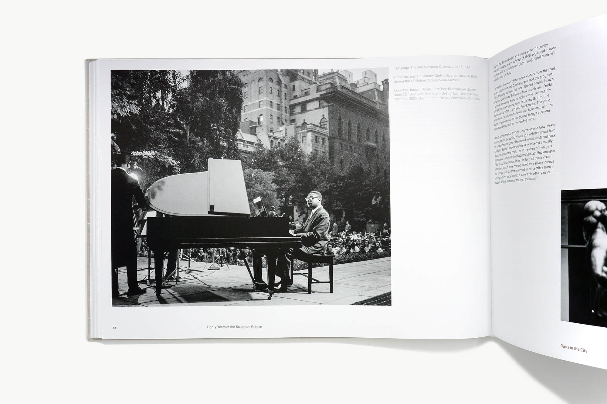
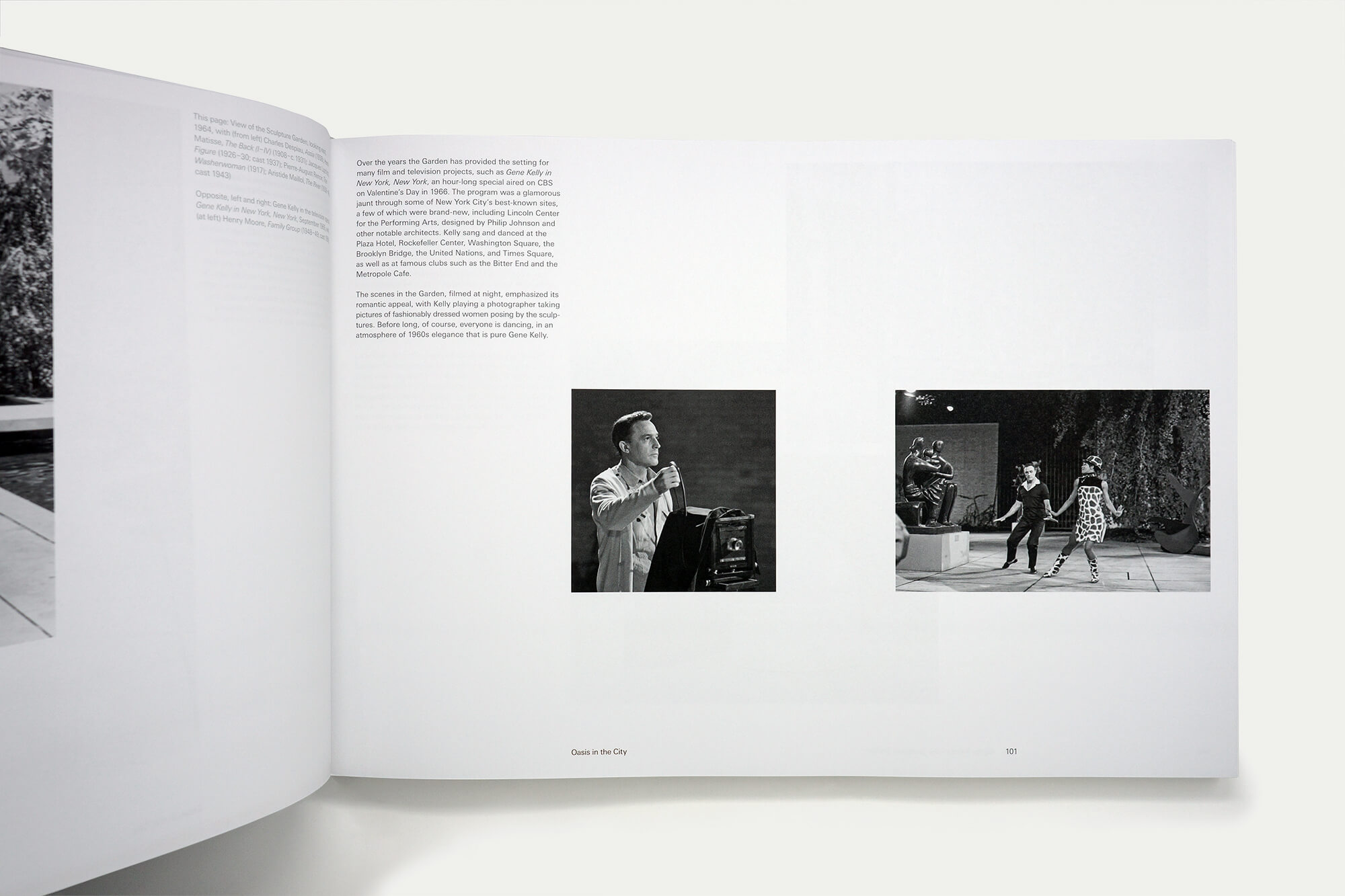
There was concern that the photographic archive in particular could end up looking like a scrapbook. To prevent this we rarely featured more than three images on a spread. It is a book that is luxurious in its use of large images and abundant white space. Judicious sizing, positioning and juxtaposition of images has resulted in lively and elegant pages.
A mirrored four column grid is used throughout the book, but the footer margin fluctuates to demark different sections. In the frontmatter and chronological essay the lower margin is very large, in the archive section it is reduced, and for the photographic essays it matches the small top margin. Small differences like this help break down a large book into more manageable sections for the reader – albeit largely subconsciously. They give the book visual pace and help to denote different types of information.
An uncoated paper is used for all the essays and archival sections mitigating the range of image quality found there and unifying their appearance. It also exaggerates a perceptible change when we reach the photographic essays, which are printed on a matt coated paper, bringing out deeper, brighter hues and contrast.
A highly systemised typographic grid, and use of Univers throughout contributed to the Miesian aesthetic. Captions are placed in the same column, left of the spine, throughout the book, and printed in a mid grey. A duotone was created using this mid grey along with a darker grey – used for the main body copy – to create the duotone of all black and white images throughout the book.
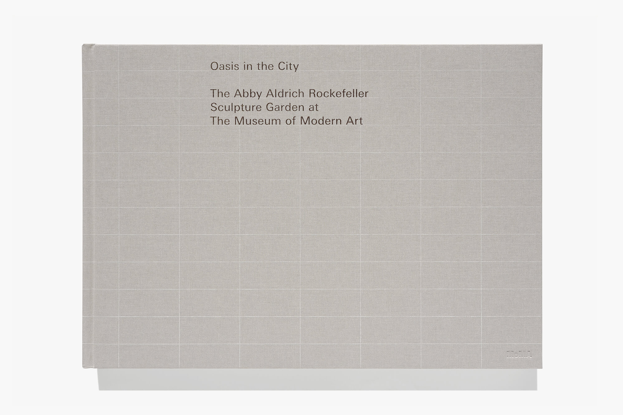
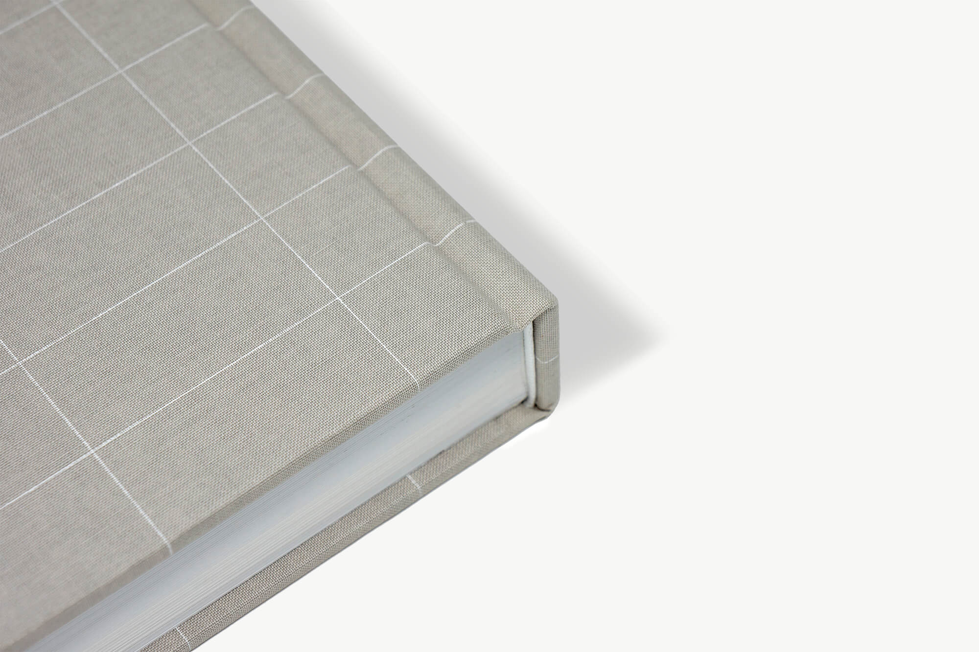
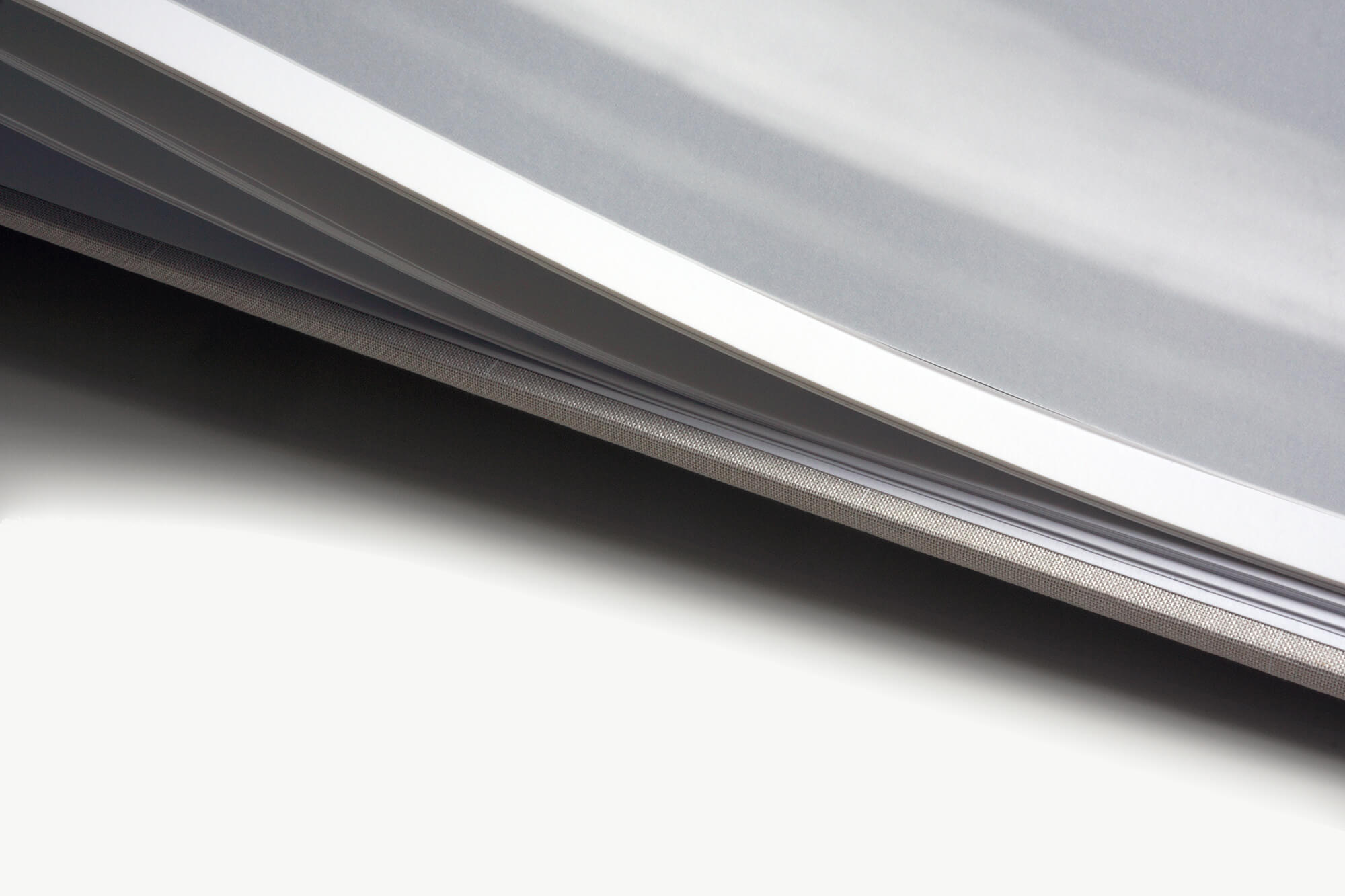
Tip-on tracing paper chapter openers, a linen case and spot colours combine to elevate the book and give an impression of restrained and dignified quality.
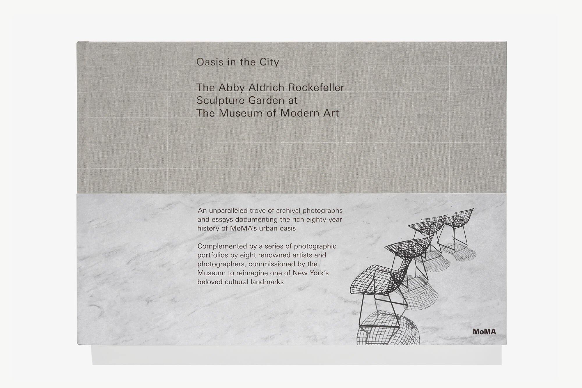
The paving slabs are detailed on the cover with thin foiled lines. A disposable demi dust jacket recalls the Bertoia chairs and marble slabs – the two elements that have remained constant since 1953.
‘When we started this project the trustees said “find the best graphic designer in the world”. We did a lot of research on graphic designers and our research led us to William Hall.’
Peter Reed, Senior Deputy Director for Curatorial Affairs, MoMA
