The stationery is a reflection of the brand values of this contemporary womenswear brand. Mother of Pearl are innovative, experimental and pioneering.
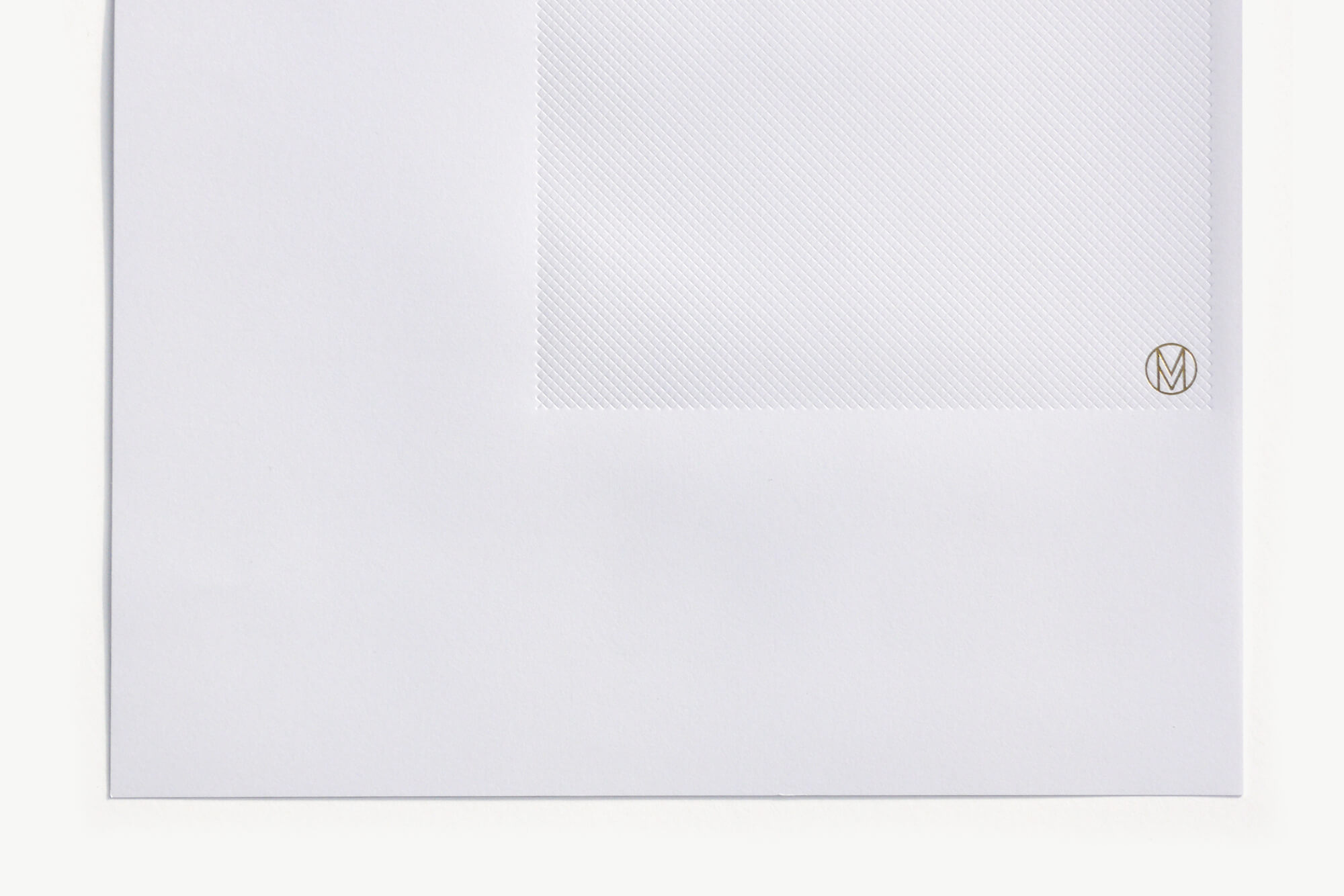
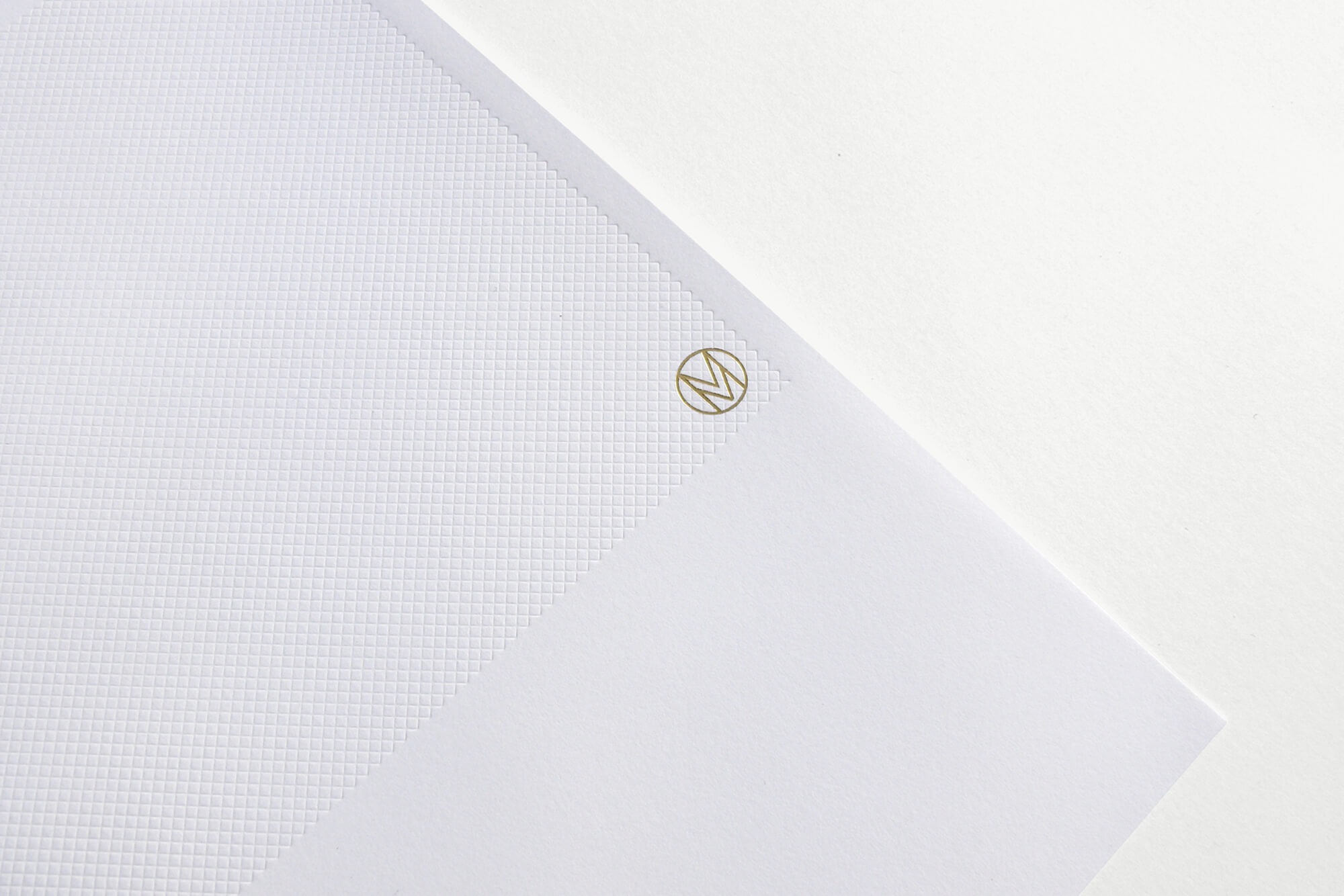
Using a three column grid, foiling and a large debossed area the letterhead contributes a significant visual statement and echoes the square fabric label used on some garments. Anyone receiving a letter from Mother of Pearl immediately understands they are a company that enjoys doing things differently.
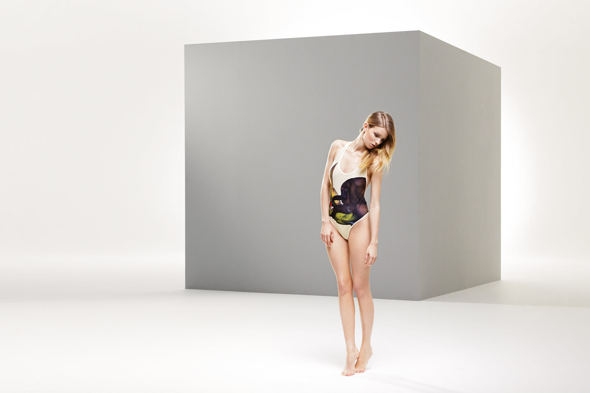
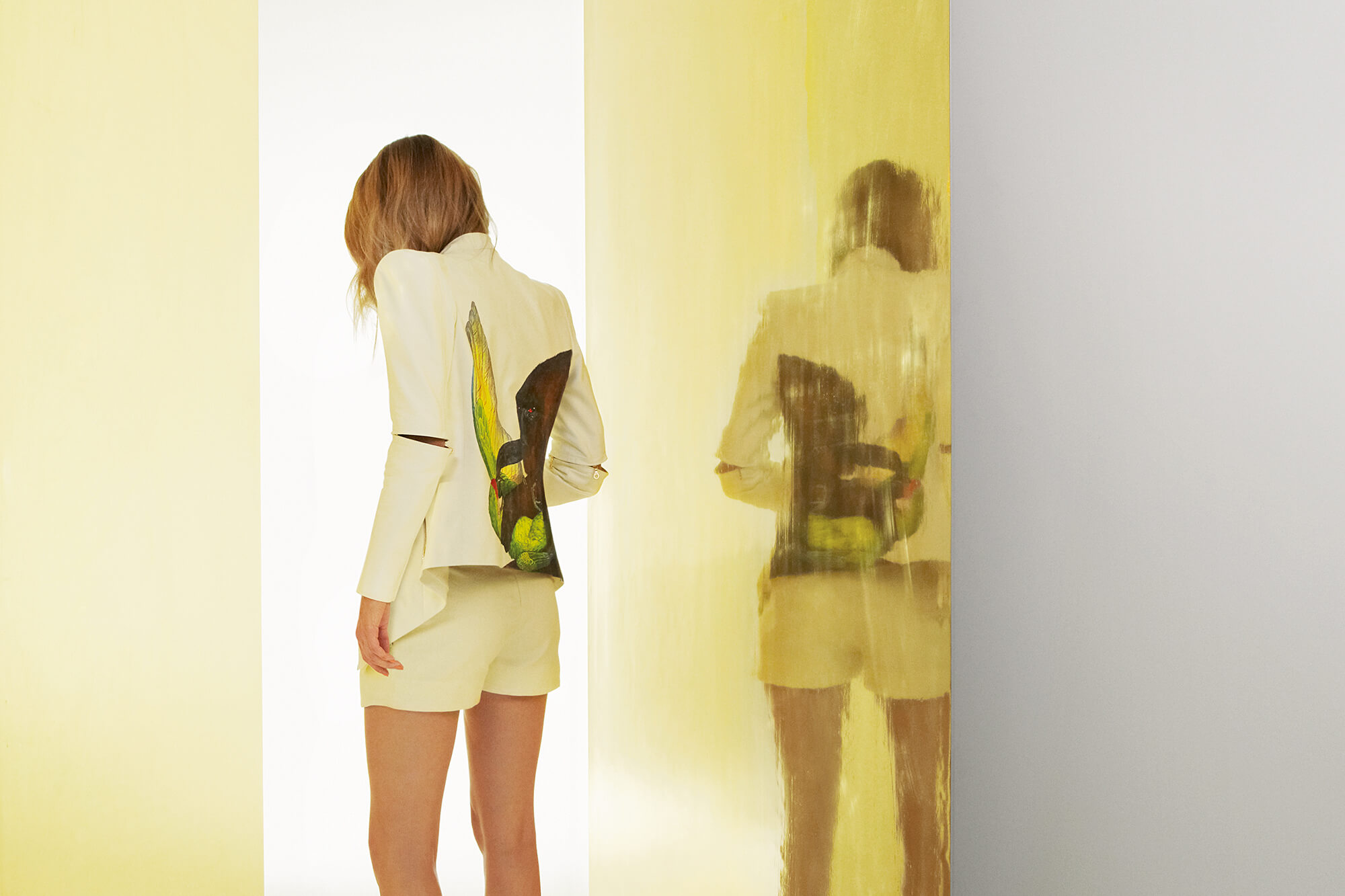
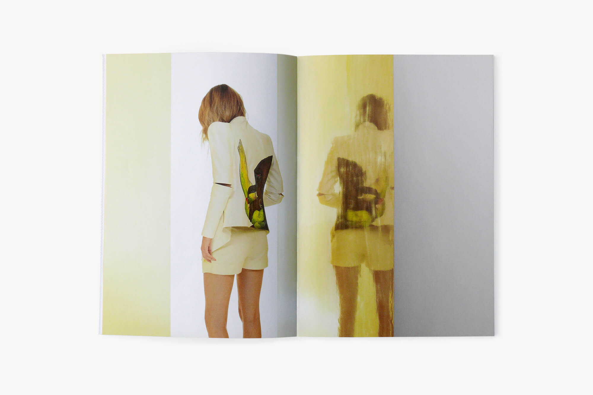
The Spring Summer 2010 Collection was modernist in styling with clean lines and drama provided via prints from YBA Mat Collishaw.
This was our first Art Direction for a fashion brand. Working in close collaboration with photographer Tim Gutt, we created a series of interior/exterior spaces from a very limited palette of grey and gold walls. The images combine stylish urban modernity with luxury.
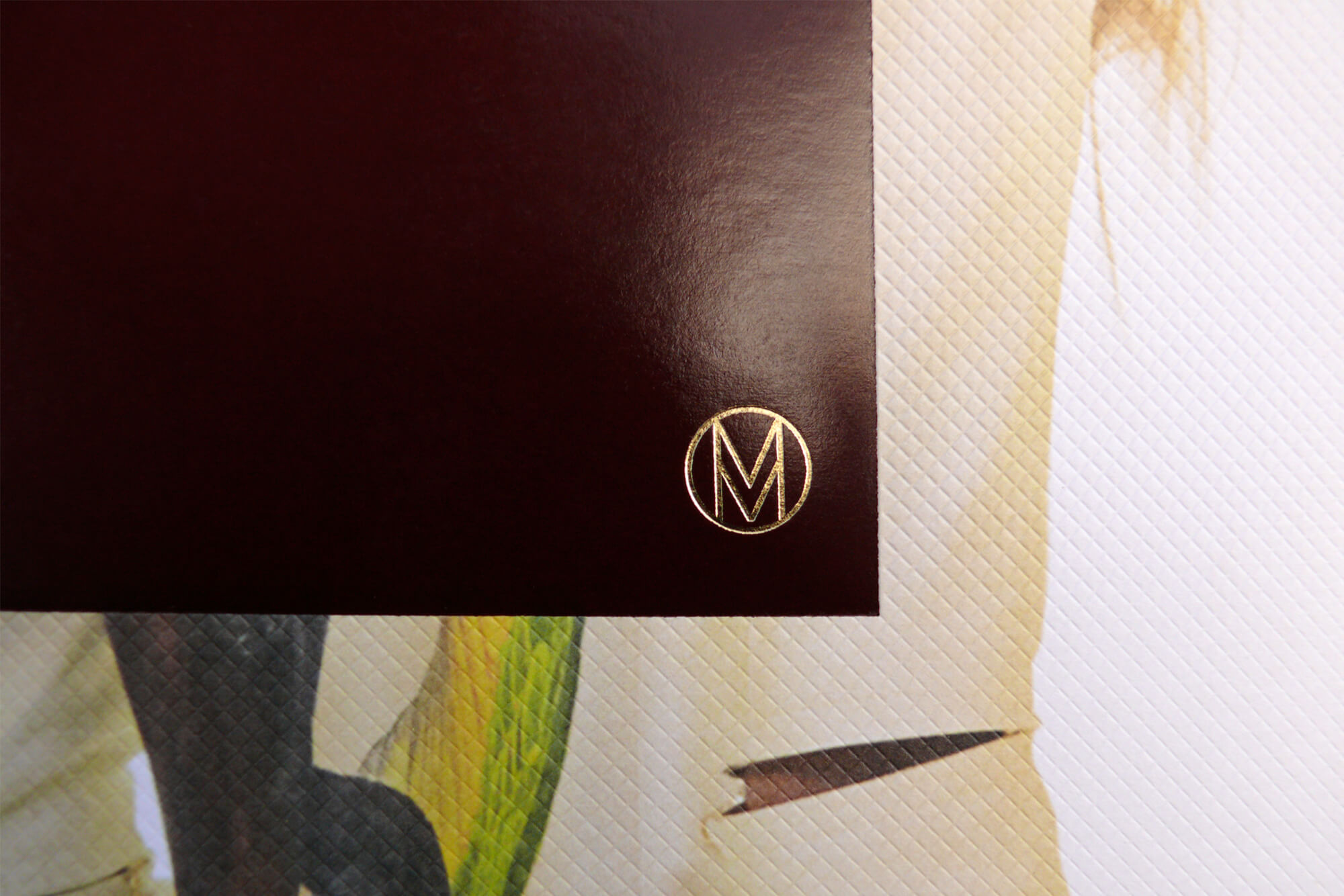
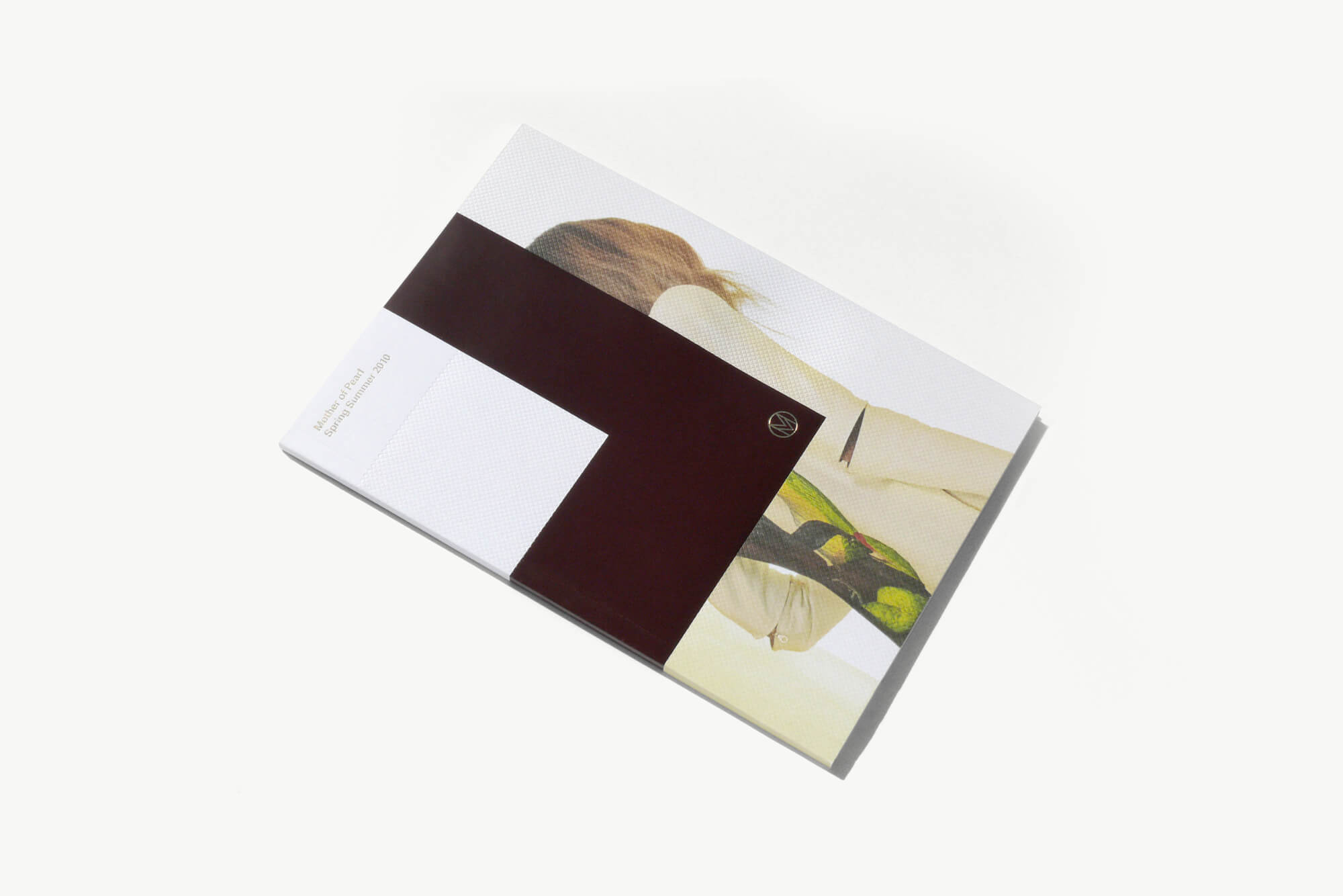
The cover echoes the invitation we made for the launch of the collection. The invitation combines a standard hangtag with a purpose made burgundy A6 invitation card. Carrying this through to the lookbook made a strong association throughout the collection.
