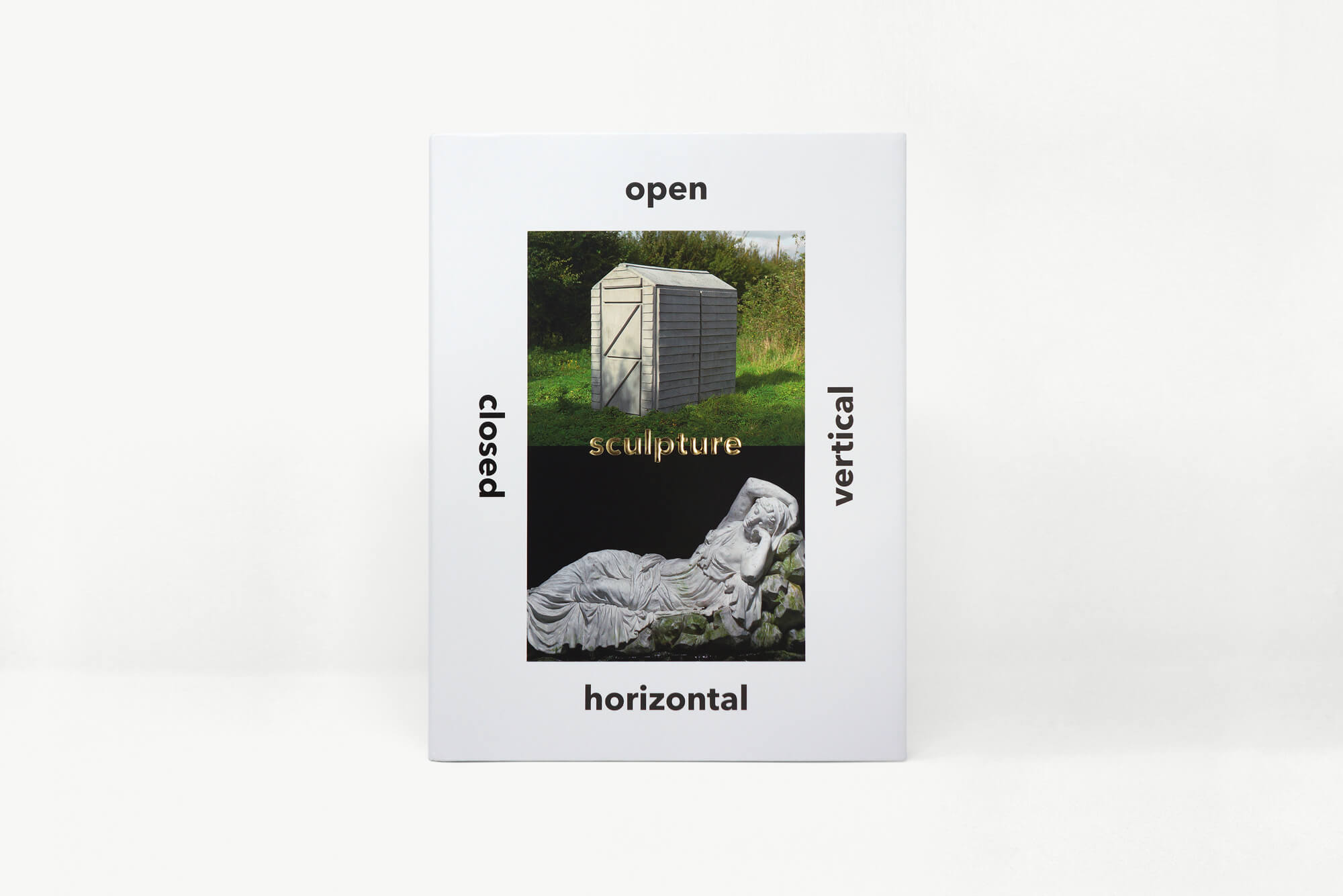
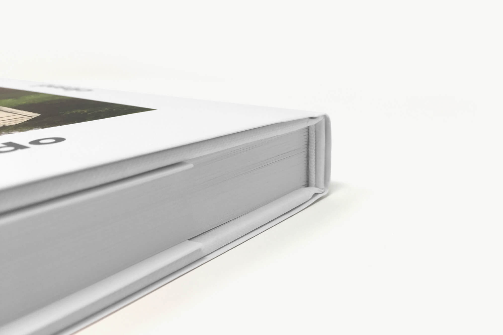
Borne out of a series of lectures by the former Director of Tate Britain, Penelope Curtis, this book observes a direct and symbiotic relationship between word and image. Some texts are short but require multiple illustrations, others are lengthy and require only one.
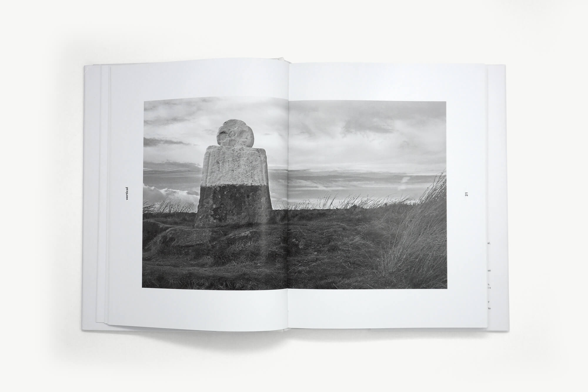
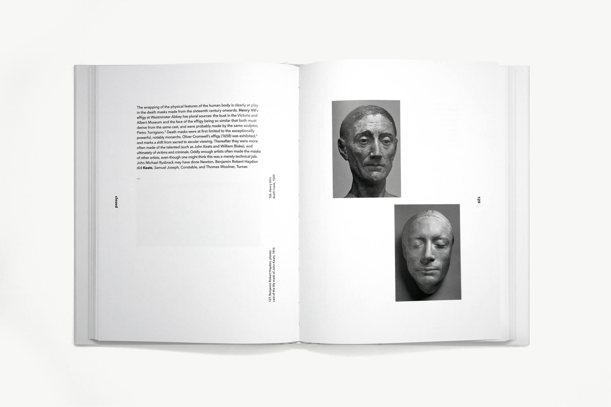
The design allows for a wide range of variables to accommodate this. There are one to four images and between 50 and 350 words per page. Simply put, a spread is complete when the left hand page is filled with text or the right hand page is filled with images.
Images are clear of notation. Captions are positioned on the left hand text page, at right angles, making them both accessible and visually recessive, and leaving the images clear to be read independently.
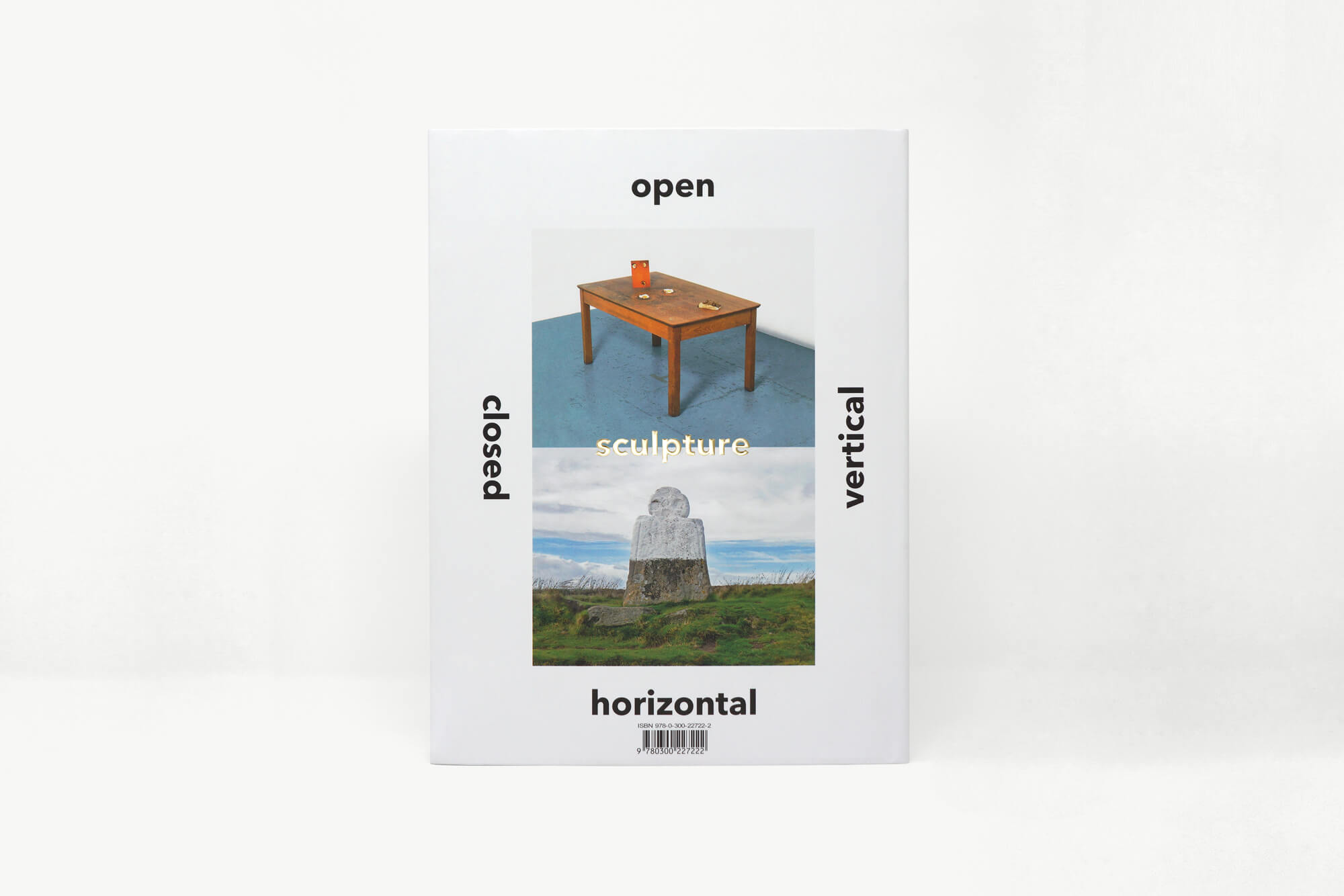
Each chapter deals with one quality of sculpture – vertical, horizontal, closed, open. Each quality is playfully referenced with the orientation of type on the cover. This idea is continued inside, so that running heads and folios are horizontal, or turned 90˚ to the left or right depending on the corresponding chapter orientation.
All contribute to the book’s unique tone – and reference one of the central elements of sculpture – that of physicality and movement – you’re encouraged to move your head or the book or both to read the text.
